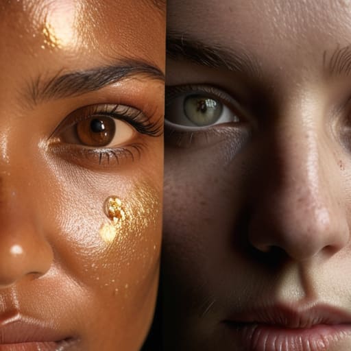
I remember a shoot in a cramped basement in Bristol, ten years back, where we were fighting a losing battle against a cheap LED panel that looked fine on the monitor but turned the lead actress’s skin a sickly, bruised shade of grey. We spent three hours trying to fix it in the grade, only to realize the sensor wasn’t the problem—the light source was fundamentally broken. This is the trap most people fall into: they spend thousands upgrading to a cinema camera while ignoring the fact that they don’t actually understand how CRI and colour accuracy matter in the first place. You can have the most expensive sensor in the world, but if your light source is lying to you, you’re just capturing expensive-looking garbage.
I’m not here to sell you a spec sheet or walk you through a marketing brochure. I’m going to tell you why a high CRI is the difference between a professional image and a digital mess that a colourist will eventually hate you for. We’ll skip the fluff and talk about how to actually see the light, how to spot a bad source before you hit record, and why your choice of lamp is more important than the lens you’re mounting.
The Invisible Thief How Cri and Colour Accuracy Matter

I’ve sat in enough color grading suites to know that the most expensive sensor in the world can’t fix a light source that’s lying to you. You can have a RED or an Arri, but if your light source is missing the red frequencies, your subject is going to look like they’ve been dead for three days. This is where the impact of light quality on skin tones becomes a practical nightmare rather than a theoretical one. When a light has a poor spectral power distribution, it isn’t just “off” by a few degrees; it’s actively deleting the subtle nuances of human complexion, leaving you with a muddy, sickly mess that no amount of digital manipulation can truly restore.
It’s easy to get lost in the math of color rendering index vs tlci, but for me, it’s about the reality of the frame. If you’re doing lighting for portraiture or high-end interviews, you aren’t just chasing a number on a spec sheet; you’re trying to prevent the colorist from having to perform surgery on your footage. A light with a high CRI doesn’t just make things look “better”—it makes them look real, giving you the headroom to actually make creative choices in post instead of just fighting to bring life back into a grey face.
Beyond the Label Color Rendering Index vs Tlci
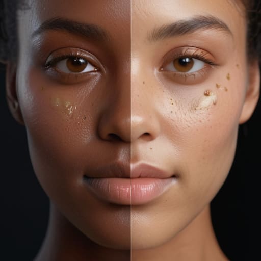
You’ll see these two acronyms plastered all over every spec sheet from here to Hollywood, and most people treat them like they’re interchangeable. They aren’t. CRI—the Color Rendering Index—is a bit of an old-school metric, a relic from the days when we were trying to figure out how much a light source deviated from a standard tungsten bulb. It’s a decent baseline, but it’s a blunt instrument. It doesn’t care much about how your sensor actually sees the world; it just cares about how much the light mimics a basic reference.
If you want to get serious about the impact of light quality on skin tones, you need to look at TLCI (Television Lighting Consistency Index). While CRI is a general measurement, TLCI is specifically calibrated for digital sensors. It’s essentially a way of asking, “How much is this light going to make the camera struggle?” When you’re comparing color rendering index vs tlci, remember that a light can have a high CRI and still produce a digital mess because its spectral power distribution doesn’t play nice with your sensor’s color science. I’ve seen plenty of “high CRI” LEDs leave a green tint in the shadows that no amount of color grading could fix without looking like a plastic fever dream.
Spectral Power Distribution Explained What Your Sensor Actually Sees
Look, the spec sheets will give you a single number, but a number is a lie. If you want to understand what’s actually happening, you have to look at the spectral power distribution explained in terms of the actual energy spikes across the spectrum. A cheap LED might claim it’s daylight balanced, but if you look at the graph, it’s likely got massive spikes in the blue and green but a hollowed-out valley where the reds should be. Your sensor doesn’t see “white”; it sees a mathematical sum of every photon hitting the gate. If those red photons aren’t there to begin with, no amount of cleverness in the grade is going to pull a healthy life back into a subject’s face.
This is where the impact of light quality on skin tones becomes a practical headache rather than a theory. When you’re doing lighting for portrait photography or a high-end interview, you’re looking for a smooth, continuous spread of color. If your light source has “gaps” in its spectrum, the skin will look muddy, grey, or unnaturally sallow. You aren’t just fighting color temperature; you’re fighting a fundamental lack of information. Once that data is missing from the sensor, it’s gone.
The Skin Tone Problem Impact of Light Quality on Skin Tones
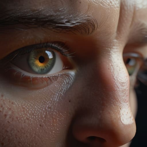
You can have the most expensive cinema camera in the world, but if you’re lighting a subject with a cheap LED panel that has a massive gap in its green-to-magenta spectrum, you’re going to have a bad time. I’ve sat in too many color grading suites watching an editor try to “fix” a face that looks like it’s made of grey clay. The problem isn’t the sensor; it’s that the light itself is missing the very frequencies needed to define a human being. When we talk about the impact of light quality on skin tones, we aren’t talking about abstract physics; we’re talking about whether your actor looks healthy or like they’ve been dead for three days.
This is where the technical side meets the emotional side of the frame. When you’re setting up lighting for portrait photography or a close-up interview, you’re looking for a light source that fills in those subtle nuances—the warmth in the cheeks, the slight translucence of the skin. If your light source is “spiky” in its spectral distribution, no amount of post-production can truly recreate that organic depth. You end up fighting the footage rather than shaping the story, and that is a fight you will almost always lose.
Lighting for Portrait Photography Why High Cri Led Lighting Benefits Win
When you’re setting up lighting for portrait photography, you aren’t just trying to make the subject visible; you’re trying to make them look alive. I’ve spent more time than I care to admit staring at monitors, trying to figure out why a perfectly exposed face looks like it’s been dusted with grey ash. It usually comes down to the light source. If you’re using a cheap LED panel with a jagged spectral power distribution, you’re essentially asking your subject to perform in a vacuum. You might have the most expensive lens in your kit, but if the light lacks the full spectrum to bounce off the subtle reds and yellows in human skin, that lens is just capturing a high-resolution lie.
This is where the high CRI LED lighting benefits actually manifest in the real world. It isn’t about a number on a spec sheet; it’s about the integrity of the color before it even hits the sensor. When you use a light that actually renders the nuances of a complexion, you spend less time in the grading suite performing digital surgery and more time actually telling a story. If you start with a solid foundation of color temperature and accuracy, you give yourself the headroom to be creative rather than just being a glorified janitor cleaning up bad footage.
Color Temperature and Accuracy Why Your Colourist Cant Fix Everything
I’ve spent enough time in dark suites to watch a professional colourist try to perform surgery on a shot that was dead on arrival. There is a common misconception among the newer crowd that if you shoot in RAW, you’ve bought yourself an infinite safety net. You haven’t. If your light source has a massive gap in its spectrum—say, a cheap LED that’s heavy on cyan but practically nonexistent in the red wavelengths—no amount of digital manipulation is going to conjure those missing frequencies back into existence. You aren’t “fixing” the image; you’re just stretching the artifacts until the skin looks like plastic.
When we talk about color temperature and accuracy, we aren’t just talking about getting the white balance right so the scene doesn’t look blue or orange. We’re talking about the integrity of the data hitting the sensor. If the light itself is fundamentally broken, your sensor is just recording a high-resolution version of a lie. You can balance the temperature in post, but you can’t fix the spectral deficiency that makes a face look sickly or muddy. A colourist can shift hues, but they cannot manufacture the nuance that a proper light source provides at the source.
Five Ways to Stop Fighting Your Footage in Post
- Stop trusting the box. A light labeled CRI 95 can still have a massive hole in the cyan or red part of the spectrum; if you can, bring a color checker to the set and actually look at the readout before you commit to a long day of shooting.
- Prioritize skin tones over everything else. You can fix a slightly cool background in a grade, but once your light source lacks the spectral depth to render the subtle reds and yellows in a human face, you’re just painting over mud.
- Watch your mixed lighting like a hawk. If you’re mixing a high-quality LED with a cheap, unrated tungsten bulb or a fluorescent overhead, you aren’t just dealing with different temperatures—you’re dealing with two different sets of color inaccuracies that will make your colorist want to quit.
- Don’t assume a “daylight” setting is a magic wand. Just because a light is set to 5600K doesn’t mean it’s actually hitting the sensor with a balanced spectrum; always check your white balance against a real-world neutral grey card, not just what the camera’s auto-white says.
- Use your eyes, not just your waveform monitor. A monitor can tell you if your levels are correct, but it won’t tell you if a light is making a subject look sickly or jaundiced; if the light looks “off” to your eye on set, no amount of sensor resolution is going to make it look natural later.
The Bottom Line
Stop treating a spec sheet like a holy text; a high CRI number is useless if the light’s spectral distribution is so broken that it turns your subject’s skin into a muddy, greenish mess that no amount of grading can fix.
Understand that color accuracy is a preventative measure, not a post-production solution—you use good light to save your colorist time, not to give them a miracle they can’t perform.
Invest your budget in light quality and placement before you chase the newest sensor; a perfect sensor will only show you exactly how much you botched the lighting in high definition.
The Post-Production Trap
You can spend forty grand on a sensor with the most beautiful dynamic range on the market, but if you’re feeding it light that’s fundamentally broken, you’re just documenting a lie in high resolution. A colourist can shift a hue, but they can’t manufacture the spectral data that wasn’t there to begin with; if your light source makes skin look like grey ash, you aren’t making a film, you’re just making a very expensive headache for the person in the grading suite.
Gethin Moreau
The Bottom Line
At the end of the day, you can own the most expensive cinema camera on the market, but if you’re feeding it garbage light, you’re just documenting a disaster in high resolution. We’ve spent a lot of time talking about CRI, TLCI, and the messy reality of spectral power distribution, but it all boils down to one thing: respecting the sensor. If your light source is missing the frequencies that make skin look alive or fabrics look real, no amount of clever grading in DaVinci Resolve is going to bring that soul back to the frame. You can try to pull a miracle out of a muddy, low-CRI mess, but you’ll spend more time fighting the footage than you will actually telling your story. Stop looking for a fix in post and start looking for it in your light kit.
I’ve spent twenty-three years watching people chase the latest sensor specs while ignoring the fundamental physics of the room. The truth is, a great image isn’t born in a digital file; it’s born in the way light hits a subject before the record button is even pressed. Don’t get paralyzed by the spec sheets, but don’t be blind to them either. Invest in light that actually renders the world as it is, and you’ll find that the camera becomes a tool rather than a hurdle. Master the light first, and the rest of the gear will finally start to make sense.
