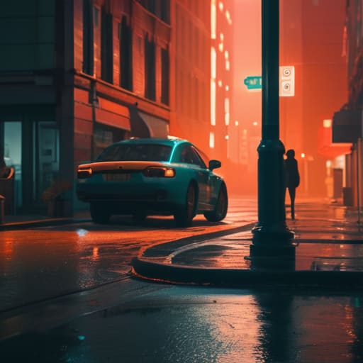
I spent three weeks on a documentary in the Highlands once, shooting on a camera that felt like it was held together by prayer and electrical tape, only to realize the footage looked like absolute garbage because I’d ignored the way the overcast sky was flattening every single shadow. I spent the next forty-eight hours staring at a monitor, trying to find a soul in the pixels. Most people think a complete guide to colour grading is going to teach you how to use a specific plugin or how to mimic a Hollywood blockbuster with a single LUT, but that’s a lie. You can spend ten thousand dollars on a colorist, but if you didn’t nail the lighting or the exposure on set, they’re just trying to paint over a cracked wall.
I’m not here to sell you a dream or a subscription to a software suite you don’t need. What I want to give you is a way to actually understand the relationship between the light you captured and the math you apply later. This isn’t a tutorial on buttons; it’s a breakdown of intent, contrast, and skin tones. I’ll show you how to make decisions that serve the story rather than the gear, and how to stop treating grading like a fix and start treating it like the final layer of cinematography.
Before the Grade a Complete Guide to Colour Grading Intent
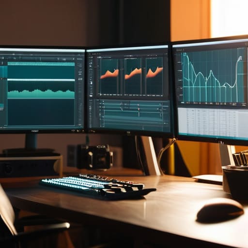
Before you even touch a slider, you need to know what you’re trying to say. I’ve seen too many editors dive into a timeline thinking they can “fix it in post,” only to realize they’re fighting a losing battle against bad physics. You have to distinguish between color correction vs color grading before you start. Correction is the heavy lifting—fixing the exposure, balancing the white point, and making sure the skin tones don’t look like they were shot under a sodium lamp. Grading is the art; it’s the mood, the temperature, and the intentionality. If you don’t have a plan for the emotional arc of the scene, you’re just moving numbers around for the sake of it.
This starts on set, not in a suite. You need to understand your color science and color space from the moment you hit record. If you’re shooting in a compressed format with no dynamic range, no amount of expensive software is going to conjure detail out of a crushed black level. I always tell my assistants: decide what the light is doing before you decide what the grade is doing. You aren’t just adjusting colors; you are reinforcing the story you already told with your lighting and your blocking.
The Line in the Sand Color Correction vs Color Grading
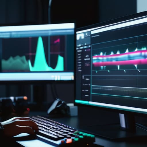
People get these two terms tangled up like a mess of XLR cables in a gear bag, but if you don’t know where one ends and the other begins, you’re just spinning your wheels. Color correction is the housekeeping. It’s the unglamorous, necessary work of fixing exposure mismatches between shots, balancing white balance, and ensuring your skin tones don’t look like they were filmed under a sodium vapor lamp. You aren’t trying to be an artist here; you’re trying to make the footage truthful. This is where understanding waveform monitors becomes your best friend, because your eyes will lie to you in a dark room, but the math doesn’t.
Once the image is technically sound and consistent, then—and only then—do you move into color grading. This is where you actually start making creative decisions. Grading is about mood, subtext, and intent; it’s the difference between a scene feeling like a sterile hospital wing or a warm, nostalgic memory. While a lut application workflow might get you halfway there, true grading is about sculpting the image to serve the story. Correction fixes the mistakes; grading builds the world.
The Math of Light Color Science and Color Space

You can talk about aesthetics all day, but if you don’t understand the math happening under the hood, you’re just guessing in the dark. When we talk about color science and color space, we aren’t just discussing how pretty a sensor looks; we’re talking about the container that holds your light information. If you shoot on a high-end cinema camera in Log, you’re capturing a massive amount of data designed to mimic the latitude of film. But if you try to force a heavy-handed look onto a compressed, 8-bit file from a consumer camera, you aren’t “grading”—you’re just breaking the image. You’ll see the artifacts, the banding in the shadows, and that digital grit that screams “amateur.”
This is where understanding waveform monitors becomes more important than any fancy plugin you’ll find online. I don’t care how much you like the look of a specific LUT; if your waveform shows you’re clipping your highlights or crushing your blacks into nothingness, that LUT is just a mask for bad data. You have to respect the math of the sensor. You manage the signal, you ensure the exposure is mathematically sound, and only then do you start playing with the art.
Reading the Signal Understanding Waveform Monitors and Data
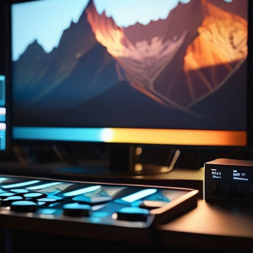
If you’re relying on the little histogram in the corner of your playback monitor or, heaven forbid, your own eyes to judge exposure, you’re playing a dangerous game. Eyes lie. They adjust to a dark room or a bright window, tricking you into thinking a shot is balanced when it’s actually a mess of clipped highlights and muddy shadows. This is where understanding waveform monitors becomes the difference between a professional image and a lucky guess. The waveform doesn’t care about your “feeling” for the scene; it shows you exactly where the data lives on a scale of black to white.
I don’t look at a waveform to see if a shot looks “pretty.” I look at it to see if the signal is intact. If those peaks are hitting the ceiling, you’ve lost detail that no amount of grading for digital cinema can bring back. You aren’t “fixing” those highlights in post; you’re just staring at digital noise. When I’m checking my signal, I’m looking for a solid foundation—enough information in the midtones and a clean roll-off in the highlights—so that when I finally move into the creative phase, I’m working with a healthy canvas rather than a handful of broken pixels.
Beyond the Preset a Proper Lut Application Workflow
I see people do this every day: they drag a heavy, “cinematic” LUT onto a clip, look at the resulting mess, and then spend three hours trying to fix the skin tones. It’s a backwards way to work. A proper lut application workflow isn’t about slapping a filter on a raw file and calling it a day; it’s about using a technical transform to get your footage into a workable space. You use a conversion LUT to move from your camera’s specific color science and color space into something standardized, like Rec.709. That isn’t “grading”—that’s just getting the math out of the way so you can actually see what you’re doing.
Once the technical foundation is level, you can move into the creative side. This is where you apply your stylistic choices, but even then, never apply a creative LUT directly to your primary footage. Always work on a node or layer above your correction. If you try to bake your look into the base image, you lose the ability to adjust your exposure or balance without tearing the image apart. You want to build a sandwich, not a single, inseparable layer of digital sludge.
Mastering the Look Cinematic Color Grading Techniques and Digital Cinema
Once you’ve stabilized the image and moved past the technical math of color science and color space, you finally get to the part everyone actually cares about: the mood. This is where we move from fixing mistakes to making choices. When people talk about cinematic color grading techniques, they’re usually looking for a shortcut—a way to make a cheap sensor look like 35mm film. But a “look” isn’t a filter you slap on at the end; it’s an extension of how you blocked the scene and where you placed your key light. If you’re trying to force a heavy teal-and-orange grade onto footage that was shot with flat, midday sun and no direction, you aren’t grading; you’re just performing digital surgery on a patient that was never healthy to begin with.
True grading for digital cinema requires you to work with the texture of the image rather than against it. You have to understand how your shadows roll and how the highlights behave when you push the saturation. I’ve seen plenty of beginners try to manufacture depth by cranking contrast, only to realize they’ve just crushed their blacks into a muddy, digital mess. Real cinematic depth comes from subtle shifts in hue and luminance, not from aggressive sliders. If you want that filmic quality, stop looking for the right plugin and start looking at how color interacts with the light you actually captured on set.
Five Ways to Stop Fighting Your Footage and Start Grading It
- Stop chasing the “film look” with heavy-handed presets. If your image looks like it was dipped in orange syrup and then dragged through a sewer, you haven’t achieved a grade; you’ve just buried your mistakes under a layer of digital sludge. A real look is built on subtle shifts in contrast and saturation that respect the original light you captured on set.
- Respect your highlights. You can try to pull detail out of a blown-out sky in the grade, but you’re essentially trying to perform surgery on a ghost. If the sensor didn’t record the data because you were too busy worrying about your aperture, no amount of expensive software is going to bring that texture back. Get the exposure right in the room, not in the suite.
- Grade in small increments. I see kids jump straight to the heavy wheels and the creative curves, and they end up with a mess. Work in tiny, almost imperceptible steps. If you can clearly see the slider moving, you’ve probably gone too far. The best grading is the kind that feels like it was always part of the original light.
- Use your scopes as your conscience. Your eyes are liars—they adjust to the room, the monitor brightness, and even the color of the walls around you. If you’re grading in a dark room, your eyes will tell you the image is fine when the waveform is screaming that you’ve crushed your blacks into oblivion. Trust the math, even when your gut feels wrong.
- Don’t forget the skin tones. You can make the shadows moody and the highlights creamy, but if the human beings in the frame look like they have jaundice or are made of blue plastic, the audience is going to check out. Find your skin tone reference early and build everything else around it; if the people don’t look real, the “cinematic” look is just a distraction.
The Bottom Line
You can’t grade your way out of bad lighting; a colorist can adjust the mood, but they can’t manufacture the texture of a well-placed key light or the depth of a proper shadow.
Stop chasing “cinematic” LUTs as a shortcut; if you don’t understand your color space and how your sensor actually recorded the data, you’re just breaking the image and hoping no one notices.
The best grade is the one that serves the story, not the one that shows off your software; prioritize exposure and skin tones first, and treat the “look” as the final layer, not the foundation.
The Myth of the Magic Button
You can spend a fortune on a colorist and a suite of high-end plugins, but if you didn’t nail the lighting or the exposure on set, they aren’t grading your film—they’re just trying to paint over a cracked wall.
Gethin Moreau
The Final Exposure
At the end of the day, color grading isn’t some magical layer of polish you slap onto a finished product to hide a lack of preparation. We’ve talked about everything from the mathematical reality of color spaces to the practical necessity of reading a waveform, and the takeaway is always the same: you cannot out-grade a bad foundation. If your exposure was off or your white balance was fighting the practical lights in the room, you aren’t grading; you’re performing damage control. A proper workflow—using LUTs as a starting point rather than a destination and respecting the limits of your sensor—ensures that the color serves the story rather than distracting from it.
Don’t get lost in the obsession with the latest software updates or the most expensive plugin suites. The gear will always change, and the sensors will always get wider and more sensitive, but the principles of light, distance, and intent are permanent. If you find yourself struggling to make a shot “look cinematic,” stop clicking buttons and go back to the footage. Look at how the light hit the subject’s eyes and how the shadows fell across the floor. If you capture the truth of the scene on set, the grade becomes a celebration of what you’ve already built, rather than a desperate attempt to fix what was broken.
