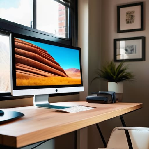
I spent three weeks on a documentary in the Highlands last year, shooting on a sensor that cost more than my first car, only to realize the footage looked like absolute garbage because I was grading it on a screen that couldn’t tell the difference between a deep shadow and a muddy mess. We’ve entered this strange era where people think knowing how to choose a monitor is just a matter of hunting down the highest resolution or the most expensive brand name on a spec sheet. It’s a lie. You can have an 8K display, but if the panel’s color accuracy is a fantasy and the brightness shifts every time you lean in to check a focus pull, you aren’t seeing your image—you’re seeing a beautifully rendered deception.
I’m not here to sell you on the latest shiny gadget or help you justify a credit card debt you can’t afford. Instead, I want to talk about what actually matters when you’re sitting in a dark room trying to make a creative decision: color consistency, bit depth, and how the panel handles the light in your actual workspace. I’ll show you how to cut through the marketing noise and find a tool that actually serves the work, rather than one that just looks good in a brochure.
Understanding How to Choose a Monitor
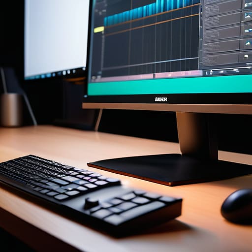
Before you even look at a price tag, you have to decide what you’re actually trying to see. Most people start with resolution, thinking 4K is the magic number, but if the panel is garbage, you’re just looking at very sharp, very precise errors. If you’re grading, you need to understand panel types explained: IPS vs VA vs TN, because that choice dictates whether your shadows stay deep or turn into a muddy, grey mess the moment you tilt your head. I’ve spent too many hours on sets looking at a screen that promised “pro” specs, only to realize the viewing angles were so narrow I had to sit like a statue just to see a consistent image.
It’s also easy to get distracted by the marketing noise surrounding gaming vs professional monitors. A high refresh rate is a marvel for movement, but for the work I do, I care far more about how a panel handles a subtle gradation in a skin tone than how fast it can flicker. You aren’t looking for speed; you’re looking for truth. If the monitor lies to you about the color, no amount of post-production wizardry is going to fix the fact that your footage looks like a different movie on every other screen.
Key Things to Know
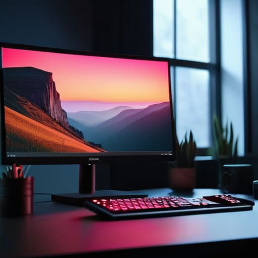
First, let’s talk about what’s actually happening behind the glass. You’ll see a dozen acronyms thrown around, but for anyone doing real work, the only thing that matters is the panel types explained: IPS vs VA vs TN. If you’re looking at a TN panel, stop right there; they’re fine for a competitive gamer who only cares about speed, but the color shifts will lie to you the moment you move your head. I’ve spent enough time in dark suites to know that an IPS panel is the baseline for anything involving a color grade. It gives you the stability you need so that what you see in your room is actually what the client sees on theirs.
Beyond the panel, don’t get blinded by the marketing fluff surrounding resolution and pixel density. A 4K screen is a tool, not a magic wand. If the screen is too small, that extra resolution is just wasted overhead; if it’s too large without the right density, you’re just looking at a different way to see artifacts. You need a workspace that lets you see the texture of the skin and the grain of the film without squinting.
Practical Tips and Steps
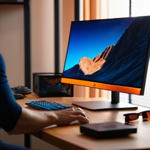
If you’re standing in a showroom or scrolling through a dozen browser tabs, stop looking at the marketing fluff and start looking at how the light behaves. Most people get tripped up by the spec wars, but for anyone actually grading or editing, the real battle is won or lost on color accuracy for creative work. You don’t need a monitor that screams “4K” if the colors shift every time you tilt your head. This is why I always tell people to look past the resolution and check the viewing angles first.
When you’re digging into the technical side, don’t let the marketing blur the lines between gaming vs professional monitors. A gamer wants high refresh rates to chase frames, but I want a stable, consistent panel that won’t lie to me about a skin tone. If you’re looking at the fine print, get a handle on panel types explained: IPS vs VA vs TN. For my money, if it isn’t an IPS, it shouldn’t be on my desk. You need that lateral consistency, or you’ll spend your entire edit correcting mistakes that only exist because your screen is playing tricks on you.
Common Mistakes to Avoid
The biggest trap I see is people treating a monitor purchase like a video game upgrade. You’ll see editors eyeing spec sheets dominated by high refresh rate and response time, thinking a faster screen makes them a better cutter. It doesn’t. Unless you’re playing Call of Duty in your downtime, that extra fluidity is just a distraction. If you’re chasing speed at the expense of stability, you’re setting yourself up for a headache.
Then there’s the obsession with raw resolution and pixel density without looking at the actual panel. I’ve seen guys drop a fortune on a 4K screen only to realize they’ve bought a VA panel that shifts colors the moment they lean an inch to the left. If you aren’t looking at color accuracy for creative work, you’re just looking at a very expensive, very sharp lie. Don’t get caught in the “gaming vs professional monitors” debate either; a gaming display might look punchy and vibrant out of the box, but it’s often lying to you about what’s actually in the file. Stick to what shows you the truth, not what looks pretty in a showroom.
Final Thoughts
At the end of the day, you aren’t buying a piece of plastic and glass; you’re buying a window into your work. If that window is warped or lying to you, the most expensive sensor in the world won’t save your grade. I’ve seen more projects ruined by a cheap display than by a bad lighting setup, simply because the editor thought they were seeing skin tones that weren’t actually there. Stop obsessing over whether a screen is marketed as a “gaming” versus a professional monitor and start looking at how it actually handles a shadow.
Don’t let the marketing departments bully you with numbers that don’t matter for your workflow. A high refresh rate and response time are fine if you’re chasing frames in a game, but for us, color accuracy for creative work is the only metric that carries weight. If the panel can’t hold a consistent color across the entire screen, it’s just a very expensive way to make mistakes. Buy the tool that shows you the truth, even if the truth is a bit uglier than the spec sheet promised.
Five things that actually matter when you’re looking at a panel
- Stop obsessing over the resolution and start looking at the black levels. You can have 8K resolution, but if the panel can’t actually hold a shadow without it turning into a muddy, grey mess, you aren’t seeing the image—you’re seeing a lie. If the blacks wash out the moment you move your head, that monitor is a toy, not a tool.
- Color accuracy is useless if the monitor’s brightness is fighting your room’s ambient light. I don’t care if it claims 100% Rec.709 if the screen is so dim you’re squinting to see the detail, or so bright it’s blowing out your highlights. Find a panel that can hold its own against the lamp on your desk.
- Check the viewing angles before you commit. I’ve seen plenty of guys buy these high-spec IPS panels only to realize that if they sit just a few inches off-center, the colors shift like a cheap mood ring. If the image changes because you leaned back to take a sip of coffee, it’s not a professional monitor.
- Don’t trust the “out of the box” settings. Every manufacturer has a different idea of what “correct” looks like, and usually, it’s tuned to look punchy and fake for a retail floor. If the monitor doesn’t give you enough granular control to calibrate it properly, or doesn’t have a reliable LUT implementation, walk away.
- Think about the connection, not just the screen. I’ve seen people spend a fortune on a beautiful panel only to realize their workstation can’t push the bandwidth required to actually drive it at the resolution they paid for. Make sure your signal chain—cables, ports, and cards—can actually handle what the monitor is promising.
The Bottom Line
Stop chasing megapixels and start looking at color accuracy; a high-resolution screen that lies to you about your shadows is just a very expensive way to make mistakes.
Prioritize the panel’s consistency over its flashy features, because if you can’t trust what you’re seeing in a dark room, you can’t trust the footage you’re delivering.
Remember that the monitor is a tool for decision-making, not a trophy; buy the one that helps you see the light correctly, not the one that looks best in a spec sheet.
The Spec Sheet Trap
Stop chasing megapixels and refresh rates like they’re a cure for bad lighting. A monitor isn’t a trophy; it’s a window. If that window lies to you about how your shadows hold or how your skin tones sit, all the resolution in the world is just helping you see your mistakes in higher definition.
Gethin Moreau
The Last Word
At the end of the day, picking a monitor isn’t about finding the one with the highest number on the box; it’s about finding the one that stops lying to you. You need to prioritize color accuracy and consistent brightness over flashy marketing terms that sound good in a press release but fail the moment you turn on your studio lights. Remember that a monitor is just a window into your data. If that window is tinted incorrectly or smudged by poor calibration, you aren’t making creative decisions—you’re just guessing in the dark. Focus on the panel quality, ensure the coverage matches your delivery requirements, and don’t let a high resolution distract you from poor color reproduction.
I’ve spent decades watching technology evolve from heavy CRT tubes to these incredible high-dynamic-range panels we have now, and if there is one thing I’ve learned, it’s that the gear is never the artist. A perfect monitor won’t give you a better sense of composition, and a cheap one won’t stop you from being a great storyteller. Use the tools you have to serve the image, and when you finally do invest in that high-end display, use it to validate your vision, not to replace it. Buy the right tool for the job, but never forget that the eye behind the screen is the only thing that actually matters.
