
I remember sitting in a dim edit suite in 2004, watching a junior colorist try to “fix” a scene by slamming a heavy teal-and-orange LUT onto a sequence that clearly needed warmth. He thought he was being profound, but he was just masking a lack of intent. People spend thousands on high-end sensors and expensive software thinking they can manufacture emotion in post, but they miss the fundamental truth of how colour affects mood at the source. You can’t fix a scene with a digital wash if you didn’t understand the light hitting the subject’s face in the first place; you’re just putting expensive makeup on a corpse.
I’m not here to sell you a plugin or tell you that a specific LUT will make your work look like a Netflix original. What I want to do is strip the pretension away and talk about actual intent. We’re going to look at how light temperature, practical sources, and deliberate color choices dictate the emotional weight of a frame before you even touch a grading panel. I’ll show you how to build a palette that serves the story, rather than one that just looks expensive.
The Illusion of Emotion How Colour Affects Mood on Screen

We spend far too much time debating whether a sensor’s color science is “cinematic” when we haven’t even bothered to look at the actual light hitting the subject. You can have the most expensive Arri Alexa in the world, but if you’re bathing a breakup scene in a cheerful, high-key amber, you’ve failed before you’ve even hit record. It isn’t about picking colors that look “nice”; it’s about understanding colour theory for cinematography as a tool for manipulation. You aren’t just decorating a frame; you are telling the audience how to breathe.
If I want the viewer to feel the suffocating weight of a character’s grief, I’m not looking for a specific LUT. I’m looking at the emotional impact of different hues and how they interact with the shadows. A heavy lean toward warm vs cool colour tones can shift a scene from a nostalgic memory to a sterile, clinical nightmare in a single lighting adjustment. Don’t rely on the colorist to fix a lack of intent in post. If the mood isn’t baked into the light and the blocking, you’re just applying expensive makeup to a corpse.
Beyond the Palette Using Colour to Influence Atmosphere
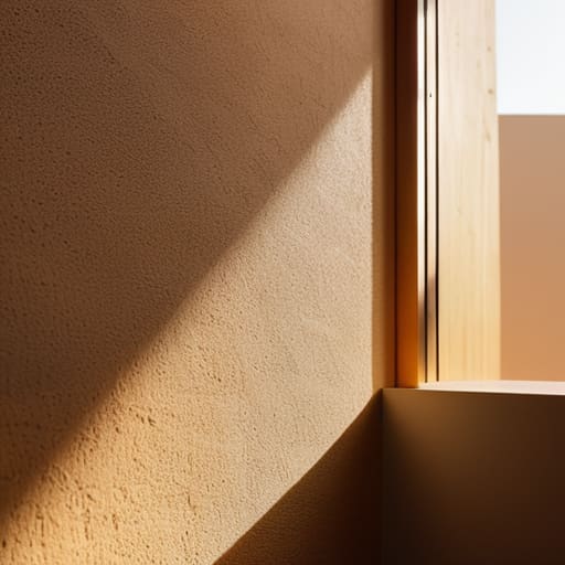
You can have the most theoretically perfect color palette in the world, but if it doesn’t sit right within the space, it’s just decoration. I’ve seen too many juniors try to force a “mood” by slapping a heavy teal-and-orange grade over a scene that was shot in a sterile, fluorescent-lit hallway. That isn’t cinematography; it’s a mask. Real atmosphere comes from understanding how the light interacts with the environment before you even touch a grading panel. It’s about the relationship between the source and the surface.
When we talk about using colour to influence atmosphere, we aren’t just talking about picking a pretty shade. We’re talking about how a sickly, jaundiced yellow in a kitchen can make a character feel trapped or unwell, or how the subtle shift between warm vs cool colour tones can signal a change in a character’s psychological state without a single line of dialogue. You have to look at the architecture of the scene. If the light is coming from a low, amber practical lamp, don’t try to fight it with a digital wash of clinical blue. Work with the physics of the room, or you’ll spend the entire edit trying to fix a fundamental mistake made during the setup.
Warm vs Cool Colour Tones Choosing Your Narrative Temperature
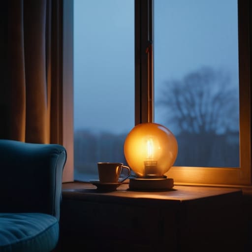
I’ve spent enough nights on set watching a gaffer struggle with a gel kit to know that temperature isn’t just a technical setting; it’s the heartbeat of the scene. When we talk about warm vs cool colour tones, we aren’t just discussing Kelvin numbers on a light meter. If you’re shooting a scene in a cramped apartment and you lean into those amber, tungsten hues, you aren’t just making it “cozy”—you’re deciding whether that space feels like a sanctuary or a claustrophobic trap. A heavy warmth can suggest intimacy, but if you push it too far without considering the shadows, it starts to feel sickly, like a fever dream.
On the flip side, pulling the temperature down into those steel blues and sterile whites is the fastest way to strip the humanity out of a frame. It’s a tool for isolation. I’ve seen directors try to use colour theory for cinematography to mask a lack of depth, but a cold wash won’t save a flat performance. If you want the audience to feel the biting chill of a character’s loneliness, don’t just reach for a blue filter; look at how the light falls. You need that temperature to feel earned, not just applied in post.
The Emotional Impact of Different Hues in a Single Frame
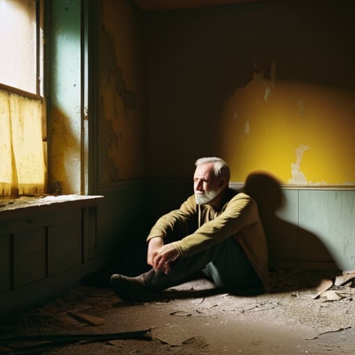
It’s easy to get caught up in the broad strokes of a “warm” or “cool” look, but the real work happens when you start playing with specific hues within a single frame. If you’ve got a character sitting in a room flooded with a sickly, jaundiced yellow, you aren’t just showing a poorly lit space; you’re signaling decay, sickness, or perhaps a mounting sense of unease. I’ve seen too many beginners try to fix a muddy image in post, forgetting that the emotional impact of different hues is established the moment the light hits the subject. You can’t just “grade in” a feeling if the base color is fundamentally dishonest to the story.
Think about the tension created by a sudden slash of deep red against a muted, desaturated background. That isn’t just a stylistic flourish; it’s a visual puncture. When we talk about colour theory for cinematography, we aren’t talking about making things look pretty—we’re talking about directing the eye to where the heartbeat of the scene is. A single, well-placed hue can act as a psychological anchor, pulling the viewer toward a specific subtext without them ever realizing why they feel suddenly on edge.
Lessons From Colour Theory for Cinematography and Intent
If you’re looking for a textbook definition of colour theory for cinematography, go buy a manual; you won’t find much use for it on a set at 4:00 AM. In practice, these theories aren’t about following a chart, they are about intent. I’ve seen shooters try to force a “sad” scene by drenching everything in blue, only to realize they’ve stripped the life out of the skin tones and left the audience feeling nothing but annoyance. You have to understand that color isn’t a layer you slap on in post; it’s a tool for directing the eye and anchoring the subconscious.
The real trick is knowing when to break the rules to serve the story. You might use the emotional impact of different hues to create a sense of unease—maybe a sickly, unnatural green in a sterile room—rather than just aiming for “pretty.” It’s less about the science of chromotherapy benefits and more about the subtle manipulation of the viewer’s gut instinct. If you aren’t thinking about how your lighting choices dictate the color palette before you even hit record, you aren’t directing the light; you’re just hoping the colorist can fix your mistakes later.
Why Chromotherapy Benefits Fail When Your Lighting Is Wrong
I see it all the time in the pitch meetings: someone brings in a mood board filled with lush, saturated teals and oranges, convinced they’ve mastered the emotional impact of different hues. They think they can just slap a heavy LUT on top in post and call it a day. But here’s the reality: you cannot fix a fundamental lack of lighting with a grade. If your base exposure is muddy or your light is coming from a flat, directionless source, no amount of digital manipulation will save you. You’re trying to paint a masterpiece on a canvas that’s already soaked in grey sludge.
People often talk about chromotherapy benefits as if color is a magic wand that works independently of physics. It doesn’t. If you’re trying to use warm vs cool colour tones to create tension, but your key light is washing out the skin tones and killing the shadows, the psychological intent disappears. You end up with a shot that feels “off” rather than “emotional.” Color theory for cinematography is about controlling the light that carries the color, not just selecting a pretty palette and hoping the sensor captures the magic.
Five Ways to Stop Treating Colour Like a Filter and Start Using It Like a Tool
- Stop trying to fix a muddy grade in post. If your lighting doesn’t have the separation and the color temperature you want on set, you’re just asking a colorist to perform miracles on a corpse. Get the base colors right with your lamps and your gels first; the grade should be a refinement, not a rescue mission.
- Watch your skin tones above all else. You can go as stylized as you want with the shadows or a heavy teal wash in the background, but if the skin looks like it’s made of wax or grey ash, the audience will disconnect instantly. Human beings are hardwired to read emotion through the face, so keep the warmth where it matters.
- Use color to create contrast, not just consistency. A scene that is entirely one hue is easy to shoot, but it’s also easy to forget. If you want a moment to land, introduce a single, opposing color—a red scarf in a grey room, a warm lamp in a cold hallway. That’s how you direct the eye without needing a giant arrow on screen.
- Think about the “temperature” of the story’s progression. Don’t just pick a color because it looks “cinematic.” If your character is losing their grip, maybe the world gets progressively cooler and desaturated. If they’re finding hope, let the light get warmer and more saturated. Make the color an arc, not a static setting.
- Remember that context is everything. A red light in a horror film feels like a threat; a red light in a romantic scene feels like passion. Before you commit to a heavy hue, ask yourself what else that color means in the world you’ve built. Don’t let your stylistic choices accidentally tell a different story than the one you’re actually filming.
The Bottom Line: Stop Chasing Palettes and Start Controlling Light
Color is a byproduct of your lighting setup, not a magic fix in post; if your base exposure and light quality are garbage, no amount of clever grading will save the emotional intent of your scene.
Choose your hues based on the narrative temperature you need to convey, but remember that contrast and saturation often do more heavy lifting for mood than the specific color itself.
Don’t mistake a trendy color grade for good cinematography; use color to guide the viewer’s eye and reinforce the story, rather than just trying to make the frame look “cinematic” for the sake of it.
The Sensor Won't Save a Bad Choice
You can buy the most expensive sensor on the market and spend ten hours in a color suite, but if you haven’t understood how a sickly green tint can make a room feel claustrophobic or how a single warm practical can anchor a character’s grief, you’re just playing with expensive math. Color isn’t a filter you slap on at the end; it’s the light you chose to let into the lens in the first place.
Gethin Moreau
Stop Looking for the Magic LUT
At the end of the day, color isn’t something you slap on top of a finished image to fix a lack of vision; it’s a tool for storytelling that should be baked into the very foundation of your setup. We’ve spent this time looking at how hues dictate temperature, how palettes build atmosphere, and why a heavy blue wash can do more for a sense of isolation than any expensive lens ever could. But remember, the most sophisticated color grade in the world won’t save a scene where the lighting was an afterthought. If you don’t understand the relationship between your light source and the intended emotional weight of the frame, you’re just painting over cracks in a wall.
My advice? Stop obsessing over the latest color science specs and start looking at the way light actually behaves in a room. Before you reach for a plugin or a complex LUT, ask yourself if the light itself is telling the truth about the character’s state of mind. The best work I’ve ever seen didn’t come from a high-end sensor or a perfect color space; it came from a DP who knew exactly how a single, warm tungsten light could make a room feel like a sanctuary or a cage. Master the light first, and the color will follow. Everything else is just noise.
