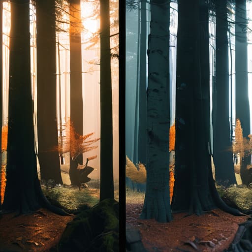
I spent three hours last week on a Zoom call with a kid who was convinced he could buy his way out of a bad exposure by upgrading to a new sensor, as if a higher bit depth acts as a magic wand for poor lighting. It’s the same old song: people treat post-production like a safety net for laziness, failing to realize that understanding how colour correction differs from grading is the only way to stop wasting time in the suite. You can’t “grade” your way out of a clip that’s crushed into blackness, and no amount of expensive LUTs will fix a scene where the skin tones look like curdled milk because you didn’t check your bounce card.
I’m not here to give you a lecture on the technical nuances of color science or a list of plugins to download. Instead, I want to show you the practical line between fixing the mess you made on set and actually building a mood. We’ll talk about what a colourist can realistically salvage from a botched setup and where you need to draw the line, ensuring you spend your time making the image feel right rather than just trying to make it look correct.
The Fix vs the Feel How Colour Correction Differs From Grading
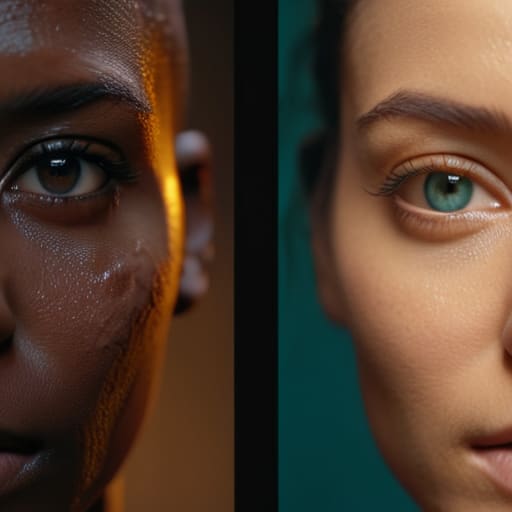
Think of correction as fixing the mess you made with the light or the exposure, while grading is where you actually start making the scene feel like something. When I’m sitting in a dark room looking at a timeline, my first job is purely defensive. I’m looking at the color balance and exposure to ensure the white balance isn’t drifting like a lost boat and that the highlights haven’t clipped into oblivion. This is the technical heavy lifting—the part where we are fixing skin tones in video so they look like human beings instead of wax figures. If you don’t get the correction right, you’re building a house on sand.
Once the image is stable and “neutral,” we move into the territory of intent. This is the grading phase, where we stop trying to fix mistakes and start trying to tell the story. This is where you decide if a scene should feel cold and clinical or warm and nostalgic. It’s the difference between a shot looking “correct” and a shot actually achieving a cinematic look. I’ve seen plenty of newcomers try to use stylized grading to mask a poorly lit set, but you can’t paint a masterpiece on a canvas that’s already torn.
The Hard Truth About Color Balance and Exposure

Here is the reality most of you won’t want to hear: if you walk into the suite with a clip that’s crushed into black or blown out into a white void, you aren’t “grading,” you’re performing an autopsy. I’ve sat in too many sessions where a client thinks a fancy LUT or some aggressive stylized color grading techniques can magically bring back the detail in a highlight that was lost because the exposure was off by two stops. You can’t grade what isn’t there. If the sensor didn’t capture the data, no amount of math in the software is going to find it.
This is where the fundamental relationship between color balance and exposure comes into play. I always tell my assistants: get the light right on set so the colorist doesn’t have to fight you. When you’re constantly pulling shadows just to see a face or twisting the temperature because your white balance was a guess, you’re eating into your dynamic range. You end up with digital noise and muddy textures instead of a clean image. If you want to spend your time making the scene feel like something, you have to start by making sure the technical foundation isn’t a disaster.
What a Colourist Can Rescue and Where You Failed

I’ve sat in dark rooms with colorists who looked like they were performing surgery on a corpse. They can do miracles, sure. They can massage a heavy shadow to find a hint of detail or nudge a stray green tint out of a face, which is the core of fixing skin tones in video. But there is a limit to the physics of the sensor. If you’ve clipped your highlights into a white, featureless void, or if your underexposure has turned your shadows into a grainy, digital soup, no amount of magic is coming to save you. A colorist can polish a diamond, but they cannot polish a piece of coal into one.
The reality is that much of the heavy lifting happens before you even hit record. If your color balance and exposure are fundamentally broken, you aren’t giving the colorist a canvas; you’re giving them a chore. You might think you’re being clever by underexposing to “save highlights,” but you’re actually just burying your signal in noise. Don’t mistake a complex color grading workflow for a way to fix bad lighting. If the light wasn’t there to begin with, the data simply isn’t there to be manipulated.
Fixing Skin Tones in Video Without Killing the Image

You can have the most expensive sensor in the world, but if your subject looks like a bruised peach or a wax figure, no amount of fancy LUTs will save you. Most people treat skin tones as an afterthought, something to be “fixed” during the grading stage, but that’s a mistake. Skin is the anchor of the frame; if the viewer’s eye doesn’t register a human face as natural, they stop watching the story and start watching the pixels. Fixing skin tones in video isn’t about slapping a filter on a mess; it’s about ensuring your color balance and exposure were handled correctly at the source so the skin sits in that healthy, fleshy range before you even touch a slider.
When you move into the actual color grading workflow steps, the goal is to protect those tones while you’re pushing the rest of the image into something more stylized. I’ve seen plenty of beginners try to force a “cinematic look” by cranking the contrast or shifting the shadows toward teal, only to realize they’ve accidentally turned their actor’s face into a sickly shade of green. You have to isolate the skin first. Treat the face as its own island—get the saturation and hue right there, and only then should you start messing with the atmosphere of the room.
Navigating Color Science in Post Production for Real Results
You can have the most expensive sensor on the market, but if you don’t understand the color science in post-production, you’re just managing a very expensive mess. Every manufacturer—Sony, Arri, RED—claims their color science is the gold standard, but what they’re really talking about is how the camera interprets light and how much “math” you have to do later to make it look natural. When I’m looking at a log image, I’m not looking for beauty; I’m looking for the data. I want to know if there’s enough information in the shadows to pull a detail out without the image turning into a grainy, digital soup.
If you want to start achieving a cinematic look, stop looking for a LUT that does the work for you. A LUT is a shortcut, and shortcuts usually lead to a dead end where your skin tones look like plastic. Instead, respect the color grading workflow steps: get your exposure right on set, balance your whites in correction, and only then move into the creative territory of stylized color grading techniques. You have to respect the math before you can break the rules.
Mastering Color Grading Workflow Steps to Achieve Cinematic Look
You don’t just jump into a grade and hope for the best; that’s how you end up with a digital mess that looks like a cheap Instagram filter. A proper color grading workflow steps sequence starts with the assumption that your footage is a raw material, not a finished product. You begin by normalizing the image—getting your shadows to sit where they belong and your highlights to stop clipping—before you even think about “style.” If you try to push a creative look before you’ve stabilized the foundation, you aren’t grading; you’re just fighting a losing battle against your own bad exposure.
Once the technical heavy lifting is done, you move into the creative phase where you actually start achieving cinematic look through intentionality. This is where you decide if the scene feels cold and detached or warm and nostalgic. I always tell my assistants to think in layers: primary adjustments for the overall mood, secondaries for isolating specific elements like the sky or a subject’s shirt, and finally, the fine-tuning of the skin. It’s a disciplined progression from fixing the math to sculpting the emotion.
Five Things to Remember Before You Touch the Wheels
- Fix the foundation before you paint the walls. If your correction is a mess—if your whites are muddy or your shadows are crushed into digital noise—no amount of “cinematic” teal and orange is going to save the shot. You can’t grade a broken image.
- Stop trying to grade your way out of bad lighting. If the light was coming from a sickly fluorescent source that turned your subject’s skin a bruised shade of green, you’ll spend half your session just trying to get back to zero. Fix the light on set so the colorist can actually do their job.
- Understand that correction is about consistency, while grading is about intent. Correction ensures the shot in the kitchen looks like it belongs in the same movie as the shot in the hallway; grading is where you decide if that movie feels like a noir thriller or a bright summer comedy.
- Don’t mistake a heavy LUT for a grade. A Look Up Table is a shortcut, often a lazy one, that can help you see a direction, but a real grade is a deliberate, frame-by-frame manipulation of contrast and saturation. If you’re just slapping a filter on top of a bad exposure, you aren’t grading; you’re just masking.
- Respect the limits of your sensor. You can pull a decent amount of detail out of a well-exposed Log image, but once you start stretching the color in a clipped or underexposed file, you’ll see the artifacts. A colorist can’t manufacture data that wasn’t there when you pressed record.
The Bottom Line for the Person Behind the Lens
Correction is your technical debt; grading is your creative intent. If you don’t pay off the debt by getting the exposure and white balance right on set, you’ll spend your entire grading session fighting the image instead of shaping it.
Don’t mistake a high-end sensor for a solution to bad lighting. A sensor can capture more data, but it can’t manufacture the way light wraps around a face or the way a shadow defines a room—that’s your job, not the software’s.
Protect your skin tones at all costs. You can push the shadows into the mud or tint the background blue all day long, but once you start mangling the natural tones of your actors to “fix” a bad shot, you’ve lost the audience.
The Difference Between Fixing and Creating
Look, correction is just the housekeeping—it’s the grunt work of making sure the whites are actually white and the shadows aren’t a muddy mess because you didn’t check your waveform on set. Grading is the actual storytelling; it’s where you decide how the scene should feel, provided you didn’t screw up the exposure so badly in the first place that there’s nothing left to work with.
Gethin Moreau
The Bottom Line
At the end of the day, if you’re heading into post-production hoping a colorist can turn a muddy, underexposed mess into a masterpiece, you’re essentially asking them to perform a miracle rather than a professional service. We’ve covered the distance between the technical necessity of correction—getting your whites white and your shadows where they belong—and the creative intent of grading. Remember that correction is the foundation of the house, and grading is the decor. If the foundation is cracked because you didn’t respect your exposure or your white balance on set, no amount of expensive LUTs or high-end software is going to make the image feel truly cinematic.
My advice? Stop obsessing over which software has the best color science and start obsessing over where you place your key light. You can buy the most expensive sensor on the market, but it won’t teach you how to see the way light wraps around a face or how a shadow can tell a story. The best images I’ve ever shot didn’t come from a perfect color grade; they came from making the right decisions in the room before the camera even started rolling. Focus on the light, get your exposure right, and the rest of the work will actually have something worth saving.
