
I spent three hours last Tuesday watching a kid in a studio apartment try to fix a jarring jump in visual tone by cycling through five different $50 color LUTs. It was painful. He was looking for a digital band-aid to fix a fundamental failure in his setup, convinced that a better sensor or a fancy plugin was the secret to how to balance shots to match. The truth is, if your light source shifted three feet to the left or your white balance drifted between setups, no amount of post-production wizardry is going to make that sequence feel seamless. You can’t software-engineer your way out of a bad foundation.
I’m not here to sell you a subscription to a plugin pack or tell you that you need a cinema rig to get consistent results. I want to talk about the things that actually matter: where you place your key light, how you manage your exposure latitude, and why your distance from the subject dictates the “look” more than your focal length ever will. I’m going to show you how to build a visual continuity that holds up in the edit, using nothing more than common sense and a light meter.
The Illusion of Consistency Why Distance Trumps Your Gear
The problem isn’t the sensor; it’s the space between the lens and the subject. I see it every week: a producer or a junior DP panicking because the A-cam looks “cinematic” while the B-cam looks like a high-end webcam. They start looking for a new lens or a software fix, but they’ve ignored the most basic physics of the frame. If you change your focal length without accounting for how that distance compresses the features of a face or how it interacts with the fall-off of your light, you aren’t just changing the view—you’re changing the entire geometry of the scene.
You can spend hours in a color grading workflow trying to force two different depths of field to look like they belong in the same room, but you’re fighting a losing battle. True consistency in cinematography comes from being disciplined with your blocking and your physical placement. If you want your shots to feel like they were born from the same moment, stop obsessing over the spec sheet and start paying attention to how the light wraps around a subject at ten feet versus five. Geometry beats gear every single time.
How to Balance Shots to Match Through Light and Shadow
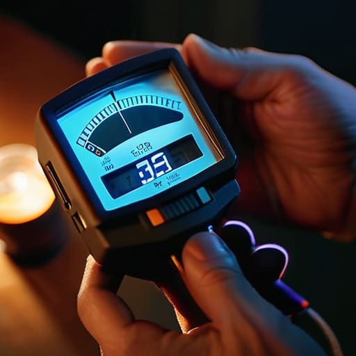
If you’re relying on a colorist to fix a mismatched scene, you’re already losing the battle. Most people think matching shots is something that happens in a dark room with a high-end workstation, but the real work happens while you’re still standing on the floor with a light meter in your hand. You can have the most expensive sensor in the world, but if your key light is coming from a warm tungsten source in one shot and a cool, diffused window in the next, you’re going to spend hours fighting the footage later. Consistency in cinematography starts with how you manage your light ratios and your white balance before you even hit record.
I’ve spent enough time staring at color wheels and vectorscopes to know that you can’t magic a shadow into existence if the lighting geometry is wrong. When you’re shooting multiple angles, pay attention to how the light wraps around the subject’s face. If the shadow side of the face is too deep in the wide shot but too flat in the close-up, no amount of clever color correction techniques will make that cut feel seamless. You have to match the quality of the light, not just the color of it.
Matching Skin Tones in Video Without a Magic Button
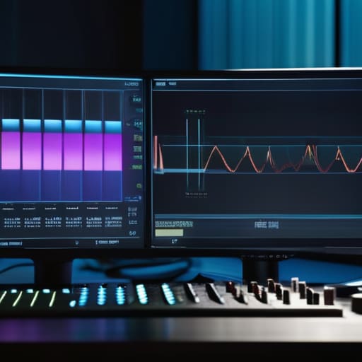
You can spend three hours in a dark room staring at a monitor, but if you didn’t get the base exposure right on set, you’re just fighting a losing battle. People think there’s a magic slider for matching skin tones in video, but the reality is much more tedious. It starts with your white balance. If you’re jumping between a Sony and an Arri, or even just two different lenses, you need to stop trusting your eyes and start trusting your tools. I’ve spent more time using waveform monitors than I care to admit, because the human eye is a liar—it adjusts to the room, whereas the waveform doesn’t.
Once you’re in the edit, don’t go looking for a miracle in your color grading workflow. You aren’t trying to “fix” the skin; you’re trying to align it. Use your color wheels and vectorscopes to find that skin tone line and pull your shots toward it. It’s about finding the common denominator between your sources. If one camera looks muddy and the other looks plastic, no amount of clever color correction techniques will make them feel like they belong in the same story. Get the light right first, or you’ll just be polishing a turd.
Reading the Truth With Waveform Monitors and Vectorscopes
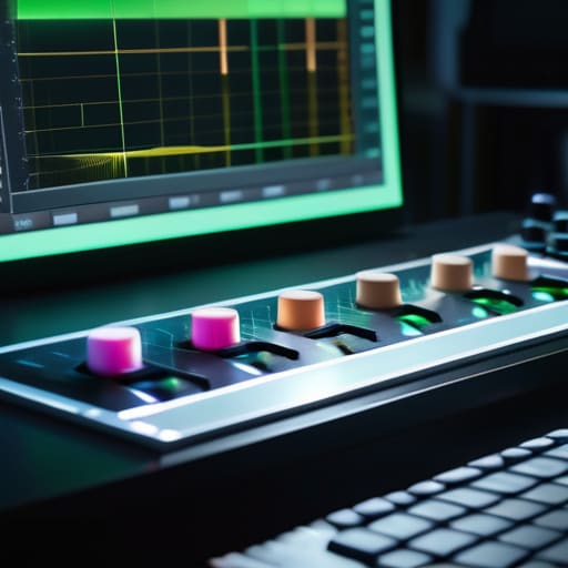
Look, I’ve seen plenty of editors try to eye-ball a match on a calibrated monitor, only to realize ten minutes later that the shot looks like a different movie entirely. If you want real consistency in cinematography, you have to stop trusting your eyes and start trusting the math. Your eyes are liars; they adjust to the ambient light in your room or the fatigue of a twelve-hour day. That’s where using waveform monitors becomes your best friend. A waveform doesn’t care if the room is dim or if you’ve had too much coffee; it tells you exactly where your highlights are clipping and where your shadows are drowning in noise. If your two shots aren’t sitting on the same plane on that graph, no amount of “feeling” your way through the edit is going to bridge that gap.
Once you’ve stabilized your exposure levels, you need to move to the vectorscope to handle the actual color. This is the backbone of any serious color correction techniques you’ll use in the suite. While the waveform handles the brightness, the vectorscope shows you the direction of your color. If you’re trying to match skin tones across two different sensors, you aren’t looking for a “pretty” color; you’re looking for that specific line on the scope where human flesh lives. If one camera is leaning too far toward magenta and the other toward green, the scope will show you the deviation instantly. It’s not glamorous, and it’s certainly not “artistic” in the way people describe it on YouTube, but it’s the only way to ensure your shots actually belong in the same sequence.
A Practical Color Grading Workflow for Grading Multiple Camera Sources
Once you’ve sat in the edit suite and realized your A-cam and B-cam are fighting each other, don’t go looking for a “match” button. A proper color grading workflow starts with correction, not grading. I always start by normalizing everything to a common baseline—usually the most difficult camera to work with. You aren’t trying to make them look pretty yet; you’re just trying to get them to the same starting line. This means using your color wheels and vectorscopes to ensure the black points and white points are sitting in the same neighborhood across all clips. If your shadows are crushed on one sensor and milky on the other, no amount of stylistic grading will save the jump cut.
When you’re grading multiple camera sources, the real work is in the skin. I spend more time looking at the skin tone line on the vectorscope than I do at the scenery. If the skin looks natural on the Sony but turns sickly on the Panasonic, you haven’t finished the job. Use your waveform monitors to check that the luminance levels of the faces match; if one actor looks like they’re in a different room because their skin is two stops brighter, the illusion is broken. Consistency in cinematography is won in these small, tedious adjustments, not in the heavy-handed LUTs people love to slap on at the end.
When Color Correction Techniques Finally Meet Real Cinematography
Look, I’ve sat in enough dark suites to know that a talented colorist can perform miracles, but they shouldn’t be expected to perform exorcisms. There is a massive difference between a professional color grading workflow and trying to force two disparate shots into a marriage that was never meant to be. If you’ve spent your day fighting to match skin tones in video because you ignored the color temperature of your key light, you aren’t color grading; you’re just managing a crisis.
The real magic happens when your color correction techniques are used to polish a foundation of intentionality rather than to patch up a mistake. When you’ve done the heavy lifting in the field—using waveform monitors to ensure your exposure is intentional and checking your vectorscopes to keep your whites from drifting—the grade becomes an aesthetic choice rather than a desperate scramble for consistency in cinematography. If you’ve set your shots up with the end in mind, you aren’t just grading multiple camera sources; you are finally telling the story the way you saw it through the viewfinder.
Five Ways to Stop Your Edit From Tripping Over Itself
- Stop chasing the “perfect” look and start chasing the same light source. If your A-cam is looking at a window and your B-cam is looking at a bounce, you aren’t making a movie; you’re making a slideshow of different rooms. Find the common denominator in your lighting before you even touch the tripod.
- Watch your focal lengths, but don’t let them lie to you. A 50mm on a full-frame sensor won’t look like a 50mm on a Micro Four Thirds, and if you try to pretend they’re the same through a digital zoom, the compression will give you away every time. Match the perspective, not just the number on the lens.
- Check your white balance in the actual scene, not on a grey card in the corner of the room. A grey card tells you what the light is, but it doesn’t tell you how that light is interacting with the skin or the walls. Look at the actual subject; if the skin looks like it’s under a sodium lamp in one shot and a fluorescent in the next, no amount of grading is going to make that transition seamless.
- Mind the depth of field like your life depends on it. If you shoot your master wide open at f/1.8 and then switch to a close-up at f/8 because you ran out of light, the viewer is going to feel that shift in the background texture instantly. It’s a subconscious jump that pulls them right out of the story.
- Get your exposure consistent at the source. I’ve seen people spend hours in DaVinci trying to pull detail out of a shadow that was crushed in-camera because they were too busy worrying about the sensor’s dynamic range. If the exposure is a mess, the footage is a mess. Fix it on set, or don’t bother filming it.
The Long View: What Actually Matters When the Edit Starts
Stop looking for a “match” button in your software; if your lighting ratios and subject distance are wildly different between shots, no amount of color grading is going to make that cut feel seamless.
Use your waveform and vectorscope as a reality check, not a crutch—get your exposure and skin tones in the right ballpark on set so you aren’t asking a colorist to perform miracles later.
Prioritize coverage that respects the physics of the scene, because a well-lit, consistent shot on a cheap sensor will always beat a mismatched, poorly lit shot on a cinema camera.
The Post-Production Lie
Stop looking for a button in your software that can fix a fundamental failure in the field; if your lighting is fighting your camera angles and your distances are all over the place, no amount of color grading is going to make those shots feel like they belong in the same world.
Gethin Moreau
The Long View
At the end of the day, matching your shots isn’t some high-level sorcery you perform in a color suite; it’s a discipline you practice while you’re still standing on the floor with a light meter in your hand. We’ve talked about why distance and lens choice matter more than your sensor’s dynamic range, why skin tones require a steady hand rather than a plugin, and why those waveform monitors are your best friends when the eyes start to lie to you. If you can get the relationship between the light and the subject right during the setup, you’ve already won half the battle. Don’t spend your time trying to fix a bad decision in post that could have been solved by simply moving a reflector or checking your white balance before you hit record.
I know the temptation to wait for that next big camera upgrade is constant, but a better sensor won’t teach you how to see. You can buy all the expensive color science in the world, but it will never compensate for a lack of intentionality in your coverage. Real consistency comes from understanding the physics of the room and the patience to get the exposure right the first time. Stop looking for the magic button and start looking at where the light is actually falling. That’s where the real work happens, and that’s the only way you’ll ever make something that actually holds together when the cuts start flying.
