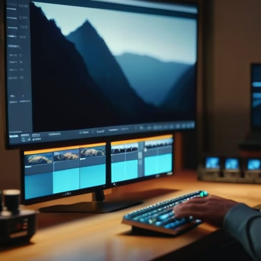
I remember sitting in a dim edit suite back in ’04, staring at a timeline that felt like a graveyard of expensive mistakes. We had the budget for a decent crew, but we lacked the scale, so we tried to patch the holes with early digital clips that looked like they were shot through a layer of Vaseline. It was a mess. People today seem to think that knowing how stock footage should be used is just a matter of having a high-speed internet connection and a subscription to some massive library. They treat it like a magic band-aid for a lack of production value, rather than a deliberate choice in visual storytelling.
I’m not here to sell you on a new plugin or a way to “hack” your way to a cinematic look. I want to talk about the actual mechanics of it—where the light in your shot meets the light in the clip, and how to ensure a transition doesn’t feel like a cheap jump-cut. I’ll show you how to use these assets to solve problems of scale or setting that your own camera simply cannot reach, without making your entire edit look like a collage of mismatched dreams.
The Lie of the Easy Fix How Stock Footage Should Be Used
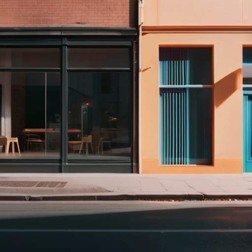
The biggest mistake I see is using a clip just because you can’t afford the location or the talent to shoot it yourself. People treat stock like a bandage for a wound in the production design, but a mismatch in grain, lighting, or even the fundamental energy of a shot will scream at the audience. If your primary scene is lit with soft, motivated window light and you suddenly drop in a high-contrast, hyper-saturated clip from a library, you haven’t “enhanced” the production; you’ve broken the immersion. Effective visual storytelling with stock clips requires you to treat the footage as if you were there, matching the texture and the mood rather than just filling a hole.
Don’t just grab the first thing that looks “cinematic.” You have to be disciplined about avoiding overused stock footage—those generic, slow-motion shots of people laughing in sun-drenched offices that every corporate video since 2010 has relied on. If you use it, use it to solve a problem of scale or a setting your own camera couldn’t reach. If you can’t make it feel like it belongs in the same world as your A-roll, don’t use it at all.
Visual Storytelling With Stock Clips Without Losing Your Soul
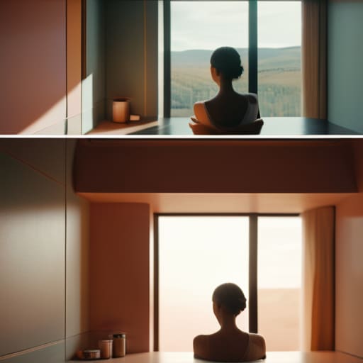
The danger isn’t in the footage itself; it’s in the laziness of the application. When you’re practicing visual storytelling with stock clips, you have to treat them like a piece of a larger puzzle, not a bandage for a hole in your narrative. If your scene is lit with soft, motivated window light and you suddenly cut to a high-contrast, saturated clip of a city street, the audience won’t just notice the jump—they’ll feel the lie. You have to match the texture, the grain, and most importantly, the emotional temperature of your primary footage.
If you want to avoid looking like a generic corporate presentation, you need to look past the “hero shots” on the landing pages. Avoiding overused stock footage means digging deeper into the archives for the imperfect, the handheld, or the strangely specific shots that feel lived-in. Don’t look for a “businessman shaking hands”; look for the way light hits a coffee cup in a crowded terminal. Use it to establish scale, to bridge a gap in time, or to provide a sense of place that your local budget simply couldn’t afford to build.
Avoiding Overused Stock Footage and the Generic Trap
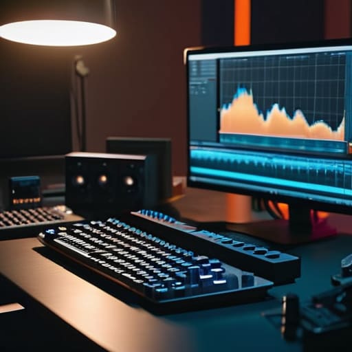
The biggest giveaway that you’re leaning on a library instead of a lens is when the footage feels like it belongs to a different movie entirely. I’ve seen countless projects where the editor tries to bridge a gap with a generic drone shot of a sunset or a slow-motion crowd in a city, but the lighting, the grain, and the color temperature are all shouting different languages. When you aren’t careful, you end up with a patchwork quilt of aesthetics that breaks the viewer’s immersion. Avoiding overused stock footage isn’t just about picking the “good” clips; it’s about finding the ones that actually share a visual DNA with your primary coverage.
If you find yourself stuck with a clip that feels a bit too “commercial” or polished for your gritty documentary aesthetic, don’t just leave it raw. Use some aggressive stock footage editing techniques—heavy grain overlays, slight color grading to pull it into your palette, or even a tight crop to hide a generic background. You have to force the footage to submit to your vision, rather than letting the clip dictate the tone of your scene.
Creative Ways to Use Stock Media to Bridge the Gaps

Think of stock media as a connective tissue rather than a bandage. When you’re stuck in a tight edit because you couldn’t afford the drone shot of the city skyline or the sweeping landscape that establishes your setting, don’t just slap it in and hope the audience doesn’t notice the jump in resolution. Instead, use it to create a sense of scale that your local setup simply can’t achieve. The trick is to integrate it through intentional stock footage editing techniques, like matching the grain or slightly softening the sharpness of your primary footage to meet the clip halfway.
You can also use it to manipulate time or memory. If you’re working on a narrative piece, a slightly de-saturated or stylized clip can serve as a non-linear flashback, providing a visual shorthand for a character’s past without needing a full production reset. It’s about finding creative ways to use stock media to serve the subtext of the scene. Whether you’re building a montage to show the passage of years or using a quick cut to simulate a frantic headspace, the footage should feel like a deliberate choice, not a budget-driven compromise.
Mastering Stock Footage Editing Techniques for a Seamless Cut
The biggest mistake I see is treating stock clips like a bandage. You can’t just slap a high-resolution landscape over a shaky handheld shot of a person talking and expect the audience to ignore the jump in texture. To master stock footage editing techniques, you have to match the “DNA” of the clip to your primary footage. This means looking past the subject and focusing on the grain, the motion blur, and the lighting direction. If your main footage was shot with soft, natural light from a window on the left, don’t drop in a clip with harsh, midday sun coming from above. It’ll look like a mistake every single time.
Beyond the physics of the image, you need to respect the rhythm. If you’re using visual storytelling with stock clips to build scale, don’t let the clip dictate the pace of your edit; make the edit dictate the clip. Cut on the action or use the motion within the stock to drive the transition into your next shot. It’s about making the viewer believe these two different worlds were captured by the same eye, even when they were shot a thousand miles apart.
Navigating Stock Video Licensing Types and Commercial vs Editorial Usage
Look, I’ve seen enough legal headaches to know that a beautiful shot is worth nothing if you can’t actually air it. Most people dive into a library, find a clip that fits their visual storytelling with stock clips, and click download without a second thought. That’s how you end up with a cease-and-desist letter sitting on your desk three months after the project goes live. You have to understand the divide between commercial vs editorial usage before you even think about your edit. If you’re selling a product, a service, or even just building a brand, you need commercial licenses that cover every face and logo in that frame.
The different stock video licensing types can feel like a minefield of fine print, but the distinction is usually simple: editorial is for news, documentaries, or “educational” contexts where you aren’t making a buck off the specific imagery. If you try to slip an editorial clip into a high-end commercial for a client, you aren’t being “creative”—you’re being negligent. Always check if the talent has signed releases. If they haven’t, that clip stays in the “use for news only” bucket, and no amount of clever color grading will make it legal for an ad.
Five Ways to Use Stock Without Making It Look Like You Used Stock
- Match the light, not just the resolution. I don’t care if your footage is 8K and the stock is 1080p; if your scene is lit with a soft, motivated window light from the left and your stock clip has harsh, overhead midday sun, the audience will feel the seam before they see it. You can fix resolution in post, but you can’t fix a fundamental disagreement in lighting direction.
- Use it to solve scale, not to hide a lack of production value. If you can’t afford a drone shot of a coastline or a time-lapse of a city skyline, buy the clip. That’s a smart use of budget. But don’t use a generic “man typing on laptop” clip just because you didn’t have the time to set up a tripod and a single key light for your actor. That’s just laziness disguised as a shortcut.
- Respect the grain and the texture. Every sensor has a signature, and every era of film has a texture. If you’re working with high-end digital footage, a clean, sterile stock clip will look like a sticker slapped onto a window. Don’t be afraid to add a bit of digital grain or a slight softening to your primary footage to help the stock clip sit in the same physical space.
- Prioritize the “why” over the “what.” Before you download a clip, ask yourself if it’s actually contributing to the narrative or if it’s just filler. If the clip doesn’t provide a specific piece of information—a sense of place, a historical context, or a scale of emotion—it’s just dead weight in your timeline that you’ll eventually struggle to cut around.
- Color grade for cohesion, not perfection. A colorist can do miracles, but they aren’t wizards. If you’re pulling in stock, try to select clips that are already in a similar color temperature range. It is much easier to grade a warm clip to look neutral than it is to try and force a cold, blue-tinted stock shot to match the golden hour warmth of your principal photography.
The Bottom Line
Stop treating stock footage like a bandage for a bad production; use it as a deliberate choice to expand the scale of your story, not to hide the fact that you couldn’t afford the location.
If the clip doesn’t share the same lighting logic or color temperature as your primary footage, don’t try to force it with a LUT—either grade it heavily to match the mood or find something that actually fits the scene.
The best use of stock is when the viewer doesn’t even realize it’s stock, which only happens when you prioritize the continuity of the emotion and the rhythm of the edit over the “wow” factor of a high-res clip.
The Scale Problem
Stock footage isn’t a shortcut to hide a lack of production value; it’s a tool to solve a problem of scale that your own camera can’t reach. If you’re using it to mask a weak concept, you’ve already lost the shot.
Gethin Moreau
The Bottom Line
At the end of the day, stock footage isn’t a magic wand that fixes a lack of vision, and it certainly isn’t a substitute for knowing how to light a scene or block a subject. We’ve talked about the traps—the generic clips that scream “budget constraints” and the licensing headaches that can sink a project before it even hits a client’s desk. If you use it to bridge a gap in scale, to provide a sense of place your production couldn’t reach, or to punch up a montage where the rhythm demands a different texture, then you’re doing it right. But if you’re just throwing it in to hide a hole in your coverage, you’re essentially telling the audience that you stopped caring about the story halfway through the shoot.
My advice is simple: treat every clip, whether you shot it on a RED or pulled it from a library, with the same level of scrutiny. Don’t let the ease of a download make you lazy with your editorial intent. A great editor knows that the most seamless transition isn’t always the one that looks most expensive; it’s the one that feels like it was always meant to be there. Stop looking for the perfect sensor or the perfect library, and start looking for the right moment. The gear and the assets are just tools—the work still comes down to where you put the eye, and more importantly, why you put it there.
