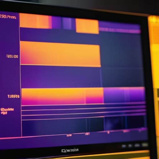
I remember standing in a damp basement in South London, sweating through my shirt while a client screamed about “image quality” because the shadows looked a bit muddy. I wasn’t looking at the resolution or the bit depth; I was staring at a waveform that told me my blacks were crushed into oblivion. People treat false colour like it’s some kind of magical, high-tech oracle, but if you think understanding how false colour works is going to magically fix a poorly lit room, you’re in for a rude awakening. It isn’t a way to make a bad image look good; it’s just a way to see exactly where you’ve already failed the light.
I’m not here to give you a lecture on sensor mathematics or the physics of photon counting. Instead, I want to show you how to use that neon-colored map to make decisions on the fly so you aren’t praying to the gods of post-production to save your footage. We’ll strip away the technical jargon and focus on what actually matters: using these visual cues to protect your highlights and keep your skin tones from falling into the digital abyss. This is about practicality over precision, and learning to trust your eyes more than your monitor.
Understanding How False Colour Works
At its core, false colour isn’t actually “seeing” color in the way your eyes do. It’s a form of pseudocolor imaging techniques designed to translate data that is otherwise invisible or difficult to parse into something our brains can process instantly. When we look at a standard waveform or a histogram, we’re looking at math. But when you pull up a false colour overlay, you’re essentially looking at a map. The camera takes the luminance values—the raw brightness data—and assigns them a specific hue based on a preset scale.
It’s a bit like how a weather map uses reds and blues to show temperature; it’s not that the air is literally red, it’s just a visual shorthand. In our world, we use this to bridge the gap between raw sensor data and a usable image. Instead of squinting at a tiny monitor trying to guess if a skin tone is falling into the shadows or if a white shirt is about to clip, the tool provides a visual translation of exposure levels. It’s a way of turning abstract numbers into a color-coded landscape, letting you see exactly where your highlights are screaming for mercy and where your blacks are turning into a muddy mess.
Key Things to Know
First, stop thinking of it as “real” color. It isn’t. When you toggle that setting on, you aren’t seeing a more accurate version of the world; you are looking at pseudocolor imaging techniques applied to your sensor’s data. The camera is simply taking the luminance values—the math of how much light is hitting each pixel—and mapping them to a specific palette. It’s a translation layer, much like a thermal imaging color mapping system, designed to turn abstract numbers into something your human eyes can actually interpret in a split second.
Second, understand that false color is a tool of utility, not aesthetics. It doesn’t care about the mood of your scene or whether the skin tones look “pretty.” Its only job is to show you where your signal is clipping and where your shadows are falling into the mud. If you treat it like a color LUT application, you’ll get lost in the weeds. Instead, treat it as a map of your exposure. It’s there to tell you if that backlight is about to turn your subject into a silhouette or if your highlights are already dead and gone.
Practical Tips and Steps
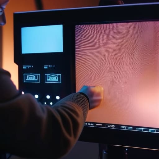
Before you start clicking through menus, remember that false color is a guide, not a law. I’ve seen too many young shooters treat the monitor like a holy text, chasing a specific shade of pink or yellow as if the sensor were a scientific instrument. It isn’t. It’s a way to translate raw data into something your eyes can actually parse. When you’re setting up, use it to find your skin tones first. If the face is sitting in that “safe” zone, you’re halfway there. Don’t get distracted by the pseudocolor imaging techniques that make the shadows look like a neon fever dream; focus on where the highlights are starting to clip.
Once you’ve got your exposure locked, don’t just walk away. Use the tool to check your consistency across different lighting setups. If you’re moving from a window to a practical lamp, check that your highlights aren’t hitting the same ceiling. It’s essentially a form of spectral data representation designed to save you from a disaster in the grade. If you can’t get the exposure right on the monitor, no amount of clever color LUT application in post is going to save that footage. Fix it in the room, not in the edit.
Common Mistakes to Avoid
The biggest mistake I see is treating the monitor like it’s handing you an absolute truth. People stare at those bright pinks and deep blues and think they’ve achieved perfection, forgetting that false color is just a form of pseudocolor imaging techniques applied to a standard sensor. It’s a translation, not a photograph. If you rely on it blindly without checking your waveform or your actual skin tones, you’ll end up with a shot that looks technically “correct” on the monitor but feels completely dead once it hits the edit.
Another trap is forgetting that what you’re seeing isn’t actual thermal imaging color mapping. This isn’t a heat map; it’s just a way to map luminance values to a specific color scale to make them easier for your eyes to parse. If you treat it like a magic wand that replaces the need for a light meter or an eye for contrast, you’re going to get burned. Don’t let the convenience of the tool make you lazy with your lighting. If the light is bad, the false color will just show you exactly how bad it is in high-definition neon.
Final Thoughts
At the end of the day, don’t let the bright neon overlays trick you into thinking you’ve mastered physics. False color is just a way of translating data into something our eyes can actually process, much like how thermal imaging color mapping turns heat into a visual language we can read at a glance. It is a map, not the territory. If you start trusting the colors more than you trust your own eyes and the way the light actually hits the subject, you’re going to find yourself in a world of trouble during the grade.
I’ve seen enough junior DPs get mesmerized by the technical wizardry of pseudocolor imaging techniques to forget that the goal is still a beautiful image, not a perfect data sheet. Use the tool to check your skin tones and ensure your highlights aren’t gone forever, but then turn it off. You need to see the scene as it will actually appear to the audience. If you can’t see the mood of the room without a digital crutch, you aren’t really seeing the light at all.
Five Ways to Not Let Your Monitor Lie to You
- Don’t mistake a color map for a measurement. False color is a visual shorthand, not a scientific instrument. If you’re relying on it to tell you the exact IRE value of a skin tone without checking your waveform, you’re asking for trouble when you get to the color grade.
- Watch your skin tones, not just the highlights. I use false color to ensure the subject’s face stays in that reliable middle-ground—usually a consistent shade of peach or green depending on your LUT—before I even think about whether the background is properly exposed.
- Remember that false color is relative to your camera’s sensor and the LUT you’ve applied. If you switch from a Sony to an Arri, or even just change your monitoring profile, those “safe” colors will shift. Always verify the tool against the actual image data.
- Use it to find your shadows, but don’t obsess over them. It’s easy to stare at the screen trying to make sure your blacks aren’t “too blue” or “too purple” on the map, but if the light is there and the sensor can see it, let it go. You can’t fix a lack of light in post, no matter how pretty the false color looks.
- Test your highlights before the talent walks on set. I’ve spent more time than I care to admit waiting for a lighting adjustment because someone saw a “red” patch on the monitor and panicked, only to realize it was just a well-exposed cheekbone. Set your ceiling early so you aren’t chasing blown-out windows mid-take.
The Bottom Line
False colour is a guide, not a gospel; it’s a way to see your exposure through a map of light, but it will never replace your eyes or a well-placed waveform.
Don’t mistake a pretty palette for a perfect exposure; use the tool to find where your highlights are screaming and where your shadows are dying, then adjust your lights accordingly.
Gear can show you the data, but it can’t fix a lack of intent—use the readout to ensure you’ve captured the scene, not as a crutch to avoid learning how light actually behaves in a room.
## The Map is Not the Territory
“Don’t mistake those bright magenta blobs for reality. False colour is just a map—a useful, colorful cheat sheet that tells you where your highlights are screaming for mercy, but it’s not the actual terrain. If you start trusting the monitor more than your eyes and the light hitting the subject, you’ve already lost the shot.”
Gethin Moreau
The Bottom Line
At the end of the day, false color isn’t a magic wand that fixes a poorly lit set, nor is it a substitute for your own eyes. It is a translation layer—a way to turn the invisible math of light into something your brain can process in a split second. We’ve talked about the way it maps luminance, how to use it to protect your skin tones, and why you shouldn’t let a bright magenta patch on your monitor convince you that your image is broken. Remember that the tool is there to help you manage exposure, not to dictate the mood of the scene. If you rely on it too heavily without understanding the underlying light, you’re just chasing ghosts on a screen.
If you take anything away from this, let it be that the best way to use false color is to learn when to turn it off. Use it to ensure your highlights aren’t screaming and your shadows aren’t muddy, but once you’ve made those calls, get back to looking at the actual texture of the image. A sensor can tell you the exact IRE level of a face, but it can’t tell you if the light feels lonely or if the shadow feels heavy. Use the tech to get the math right, then use your gut to make the image right. That is where the real work begins.
