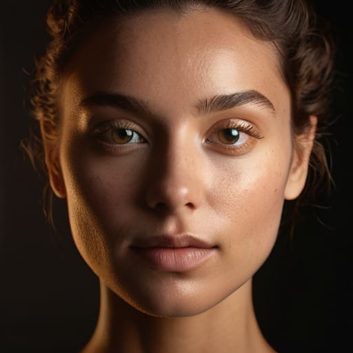
I spent three hours last week watching a kid on a YouTube tutorial explain how to achieve “cinematic depth” by recommending a $2,000 specialized LED panel with a specific color science. It was exhausting. He spent ten minutes talking about bit depth and none of it on the fact that he was lighting his subject from dead-on, washing out every ounce of character. The truth is, you don’t need a better sensor or a smarter light to fix a flat image; you just need to understand how key light placement changes a face. A light positioned two inches to the left or ten degrees higher does more work for your storytelling than any software plugin or high-end glass ever will.
I’m not here to sell you on a gear list or walk you through a menu of expensive presets. My goal is to show you the geometry of the human head and how moving a single source can turn a flat, lifeless shot into something with actual weight and intention. We’re going to talk about shadows, distance, and why sometimes the best way to make a subject look better is to simply stop lighting them so much.
The Geometry of Intent How Key Light Placement Changes a Face
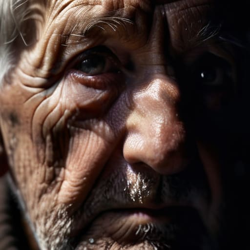
Forget the technical diagrams for a moment and look at the person in front of you. A face isn’t a flat surface; it’s a landscape of peaks and valleys. When you place your key light, you aren’t just illuminating a subject; you are deciding which parts of that landscape to reveal and which to bury. If you put that light dead-on, you kill the dimension, turning a human being into a two-dimensional cutout. You lose the shadow depth and facial structure that tells the audience who this person is before they even speak.
If you want to add weight or mystery, you move the light to the side. This is where we get into the territory of Rembrandt lighting explained—that small triangle of light on the cheek that creates a sense of volume. Or, if you’re looking for something more glamorous and less gritty, you move it up and center for a butterfly effect. It’s not about following a manual; it’s about choosing an angle that matches the character’s internal state. You aren’t just setting up a shot; you are sculpting with light to dictate how we perceive their very soul.
Shadow Depth and Facial Structure Why Darkness Is Your Best Tool

Most newcomers treat light like a way to erase shadows, as if darkness is a mistake that needs fixing. They flood the subject with light, hoping to see every detail, but all they end up with is a flat, lifeless image that lacks any sense of weight. If you want to actually define a person, you have to stop being afraid of the dark. It’s the absence of light that does the heavy lifting here. By manipulating shadow depth and facial structure, you aren’t just illuminating a subject; you are sculpting them. A shadow tucked under a cheekbone or the way a jawline disappears into a dark background provides the information the eye needs to understand shape.
When people ask me about Rembrandt lighting explained, they usually want a technical formula, but what they’re actually asking for is how to create drama. It’s about that small, controlled triangle of light on the cheek that separates the face from the void. You don’t need a massive, expensive kit to achieve this; you just need to understand that where you don’t put the light is just as important as where you do. Control the falloff, and you control the emotion.
Beyond the Three Point Lighting Setup Finding Real Cinematic Texture
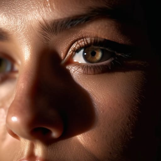
Most people come at this thinking the three-point lighting setup is the finish line, but in my experience, it’s usually just the starting block. If you follow the textbook too closely, you end up with a look that’s clean, safe, and utterly lifeless—the kind of lighting that looks like a high-end pharmaceutical commercial. To get actual texture, you have to stop treating the light like a way to illuminate a subject and start treating it like a way to sculpt them.
Instead of aiming for that perfect, balanced symmetry, I tend to lean into the tension between different portrait lighting angles for mood. You might play with the classic Rembrandt lighting explained in every primer, but don’t just aim for the triangle on the cheek; aim for the way that shadow separates the nose from the cheekbone. Sometimes, the real magic happens when you stop trying to balance the light and start deciding which parts of the face you’re willing to lose to the dark. It’s about the intentionality of the falloff, not the perfection of the exposure.
Rembrandt Lighting Explained the Math of a Single Shadow
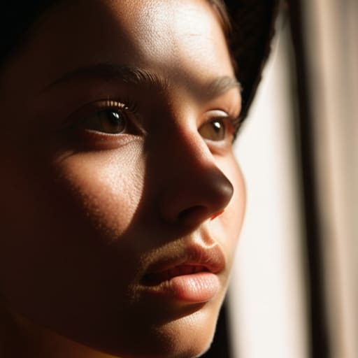
People love to treat Rembrandt lighting like some kind of sacred, untouchable geometry, but at its core, it’s just a practical way to use a single source to create shape. You aren’t looking for a mathematical miracle; you’re looking for that small, inverted triangle of light on the cheek of the shadowed side. If that triangle is too big, you look like you’re standing in a spotlight; too small, and the face just disappears into a muddy mess. It’s a delicate balance of portrait lighting angles for mood, where the goal is to use the shadow to define the nose and cheekbone rather than just letting the darkness swallow the subject whole.
I’ve seen too many juniors try to force this by cranking a light to 100% and hoping the shadow falls in the right place. That’s not how it works. To get it right, you have to understand how the light interacts with the plane of the face. You’re essentially trading away half the detail to gain a sense of volume. When you move that key light just a few inches off-axis, you aren’t just changing a setting; you are redefining the subject’s bone structure through nothing but controlled absence.
Butterfly Lighting vs Side Lighting Choosing Between Glamour and Grit
If you’re looking to make someone look like a movie star in a perfume commercial, you go for butterfly lighting. You place that key light high and directly in front of the subject, slightly above eye level, so it casts that small, symmetrical shadow right under the nose. It’s a clean, flattering look that fills in the wrinkles and smooths out the skin, which is why it’s a staple in high-end portraiture. But don’t mistake that for “good” cinematography; it’s often too polite. It lacks the tension that makes a frame feel lived-in.
When you want to tell a story about someone who’s seen some things, you move that light to the side. Side lighting—or split lighting, if you’re feeling dramatic—is where you actually start playing with shadow depth and facial structure. By pushing the light to a 90-degree angle, you aren’t just illuminating a face; you’re carving it out of the darkness. It creates a harsh divide between what we see and what we don’t, which is far more effective for building character than any expensive lens ever could. It’s the difference between a headshot and a moment of truth.
Portrait Lighting Angles for Mood Mastering the Distance of Light
Once you understand the basic geometry, the real work begins with how you manipulate the distance between the source and the subject to dictate the emotional temperature of the frame. I’ve spent more time than I care to admit nudging a light stand six inches to the left just to change a character from “heroic” to “hiding something.” When you bring the light closer, you aren’t just increasing exposure; you’re increasing the quality of the falloff. A light placed tight to the face creates a rapid, aggressive transition into shadow, which is how you build tension. If you back that light off, you’re softening those edges, trading grit for a more approachable, even-handed look.
It’s not just about the angle, though—it’s about the intent behind the falloff. You can use the same basic three-point lighting setup to create a sense of safety or a sense of isolation, simply by adjusting how much control you have over the light’s reach. If you want to master portrait lighting angles for mood, stop thinking about “brightness” and start thinking about the gradient of the shadow. A steep, close light creates a hard-edged drama that no amount of post-production can mimic, while a distant, soft source creates a sense of calm that feels almost too easy. Choose your distance based on the story, not the exposure meter.
Five Ways to Stop Lighting a Subject and Start Shaping Them
- Stop chasing the perfect light and start chasing the nose. The distance between your key light and the subject’s midline determines whether you’re filming a flat, lifeless mask or a character with actual bone structure. If the face looks like a pancake, move the light further to the side; don’t reach for a softer diffusion when you really just need a better angle.
- Watch the eyes, not the skin. A key light placed too high might give you a nice glow on the forehead, but if you lose the catchlight in the eyes, you’ve lost the soul of the shot. I’ve seen more “cinematic” footage ruined by dead, empty eyes than by a grainy sensor. If the eyes aren’t sparking, your light is in the wrong place.
- Use the shadows to do the heavy lifting. Beginners often try to fill in every dark spot with a secondary light because they’re afraid of what they can’t see. But the placement of your key is what dictates the shape of those shadows. If you want to show age, grit, or even just a sense of mystery, let the shadows stay where they fall. A colorist can fix a tint, but they can’t manufacture depth that wasn’t captured in the raw file.
- Mind the chin and the neck. A common mistake is placing the light so high that it creates a “raccoon eye” effect or, conversely, so low that it flattens the jawline into nothingness. If you want a sharp, authoritative look, keep the light slightly above eye level but angled to define the jaw. If you want something softer, more vulnerable, bring it closer to the lens axis.
- Distance is your most underrated modifier. People spend thousands on specialized softboxes when they could just move the light three feet back. The further the light is from the face, the more the light “wraps” or fails to wrap, depending on your intent. Before you buy a new kit, try moving the stand. Usually, the difference between a professional look and an amateur one is just a matter of a few feet of floor space.
The Bottom Line: Stop Buying, Start Moving
A more expensive sensor won’t fix a flat face; if the subject looks lifeless, it’s because you haven’t moved the light far enough to create a shadow, not because you need more dynamic range.
Stop treating lighting like a checklist of “modes” and start thinking about the geometry of the person in front of you—the light should be reacting to their bone structure, not a textbook diagram.
Coverage is useless without intent; decide if you want the character to look approachable or interrogated before you even touch the power switch, because the angle of your key light is the first thing the audience will feel.
## The Illusion of Depth
“A sensor can capture every pore on a subject’s skin, but it can’t manufacture a soul; that’s the job of the light. You don’t change a face by swapping a lens or upgrading to 8K—you change it by moving that key light three inches to the left to let the shadows actually do the work of carving out a human being.”
Gethin Moreau
The Final Frame
At the end of the day, you’ve seen how a few inches of movement can turn a flat, lifeless image into something with actual weight. We’ve covered the math of the Rembrandt triangle, the way side lighting pulls out the grit of a character, and why that butterfly setup might be exactly what you need for a moment of pure glamour. But the takeaway shouldn’t be a checklist of angles to memorize. It’s about understanding that light is a sculpting tool, not just a way to make sure the subject isn’t in total darkness. Whether you are chasing the softness of a motivated window or the harsh, dramatic edge of a single tungsten bulb, remember that the placement of your key is what dictates the emotional honesty of the performance on screen.
I know the temptation is to go out and buy a new light modifier or a more sophisticated control kit to fix a shot that feels “off.” Trust me, I’ve been there, and it rarely works. Before you click ‘add to cart,’ just walk around your subject. Change the distance, tilt the barn doors, or simply move the stand six inches to the left. Most of the time, the cinematic magic you’re looking for isn’t hidden in a piece of high-end glass or a sensor with more dynamic range; it’s hidden in the relationship between the light and the bone structure right in front of you. Stop chasing specs and start chasing the shadows.
